LIFE MARINE n
°
1
Book Concept
Born from a deep passion for marine life, this book concept serves as a creative blueprint for an illustrated series on marine ecosystems.
The first installment focuses on the vibrant marine life of the Galápagos Archipelago, with future volumes exploring other regions of the world.
Illustrations done on Procreate, then transferred over to InDesign.
GABRIEL MURJANI Brand Card
Created for Design I ART-UE 401 Class at NYU, wherein the assignment was to create a logo, wordmark, and business card for a personal brand idenity.
Inspired by Swiss design, this business card was designed to emulate vintage yet timeless qualities, like Modernist prints of the 50s-60s.
Logo designed on Illustrator, then transferred to InDesign.
“ANTI-GENTRIFICATION”
Guerilla Poster
This political poster addresses the contentious issue of gentrification in New York City. While often criticized, gentrification persists as many accept its cycle of "affordable" relocation.
Queens and Brooklyn have experienced dramatic waves of gentrification, leaving neighborhoods nearly unrecognizable. This poster highlights the vitality and necessity of immigrant communities, urging us to recognize that continuous gentrification erodes an integral part of the city’s soul.
Created on Procreate and Illustrator.
BROOKLYN ACU.
Mock Branding
This logo and wordmark were designed as a mock rebrand for Brooklyn Acupuncture Medicine.
The logo aims to convey the idea of acupuncture as a form of medicine. It features a stylized acupuncture pin, with the pinhead shaped like a heart, symbolizing care and healing. The heart also incorporates the letters "B" and "A," representing the brand's initials.
Created on illustrator.
DORAEMON BOOK
Cover Concept
This book cover aims to embody the spirit of Doraemon, one of the most iconic silhouettes in pop culture. Like Mickey Mouse, Doraemon has transcended boundaries, appearing in both high and low art, countless brand collaborations, and becoming a globally recognized figure.The wooden cover reflects the Japanese tradition of craftsmanship, with Doraemon’s image etched into the surface. This design positions the book as a container for the multi-genre, multifaceted manifestations of the Doraemon character.
“THE KENMARE-DELANCEY”
A Found Typeface
The Kenmare Delancey is a typeface designed by Gabriel Murjani in 2022, inspired by the eclectic spirit of Manhattan’s Lower East Side.
The typeface is composed of found objects gathered from Kenmare Street, Delancey Street, and their intersections, including nearby parks, storefronts, galleries, and residences.
Each letter reflects the gritty and vibrant character of the neighborhood, with some objects unique to the area—like the letter "B," sourced from the iconic Moscot eyeglasses storefront.
Special thanks to Jeanne Verdoux for her advice.
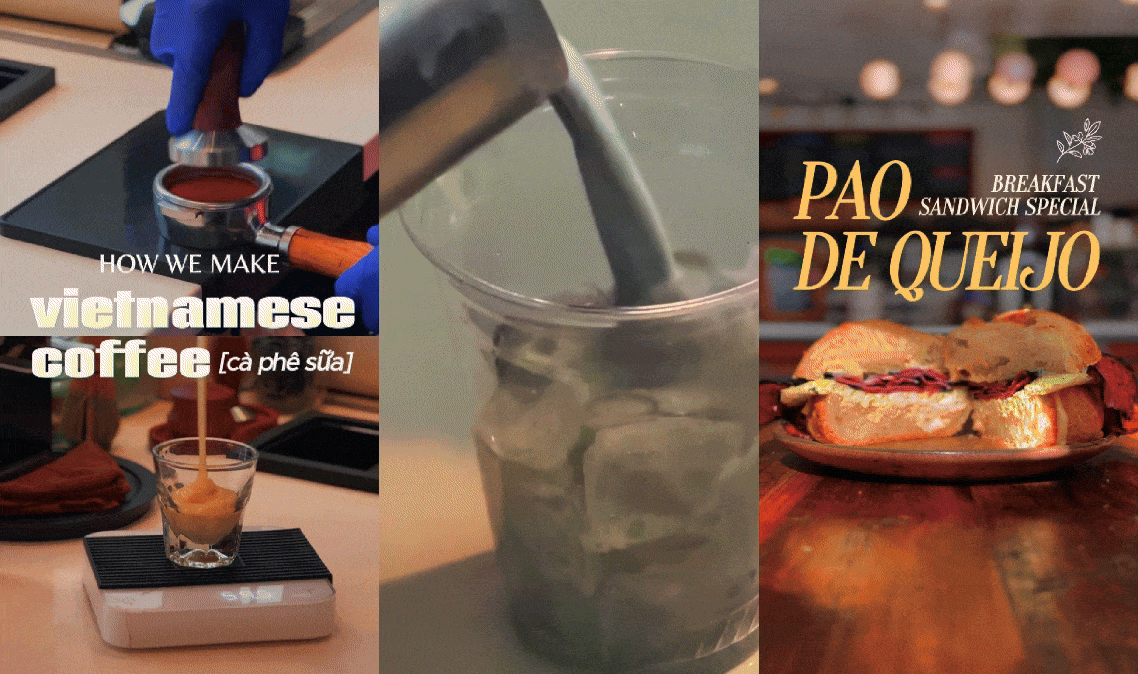
BABY’S KUSINA Promo Fliers
Social media graphics created for Baby’s Kusina + Market, a Filipino restaurant, cafe, and grocery located in the Brewerytown nieghborhood of Philadelphia.
The graphics showcase various pop-up events hosted by Baby’s, featuring various vendors and artists as well.
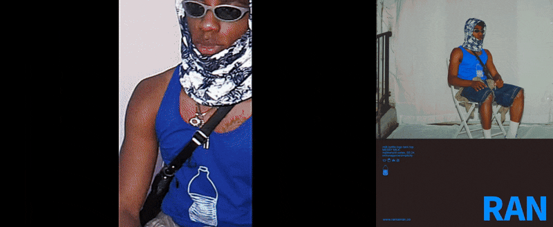
RAN Fliers
Created for RAN Milk, a personal clothing brand.